Dr. Nut Site
Project Overview
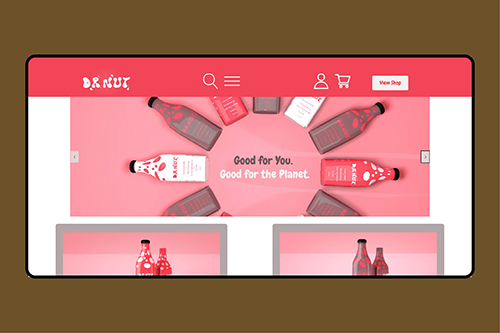
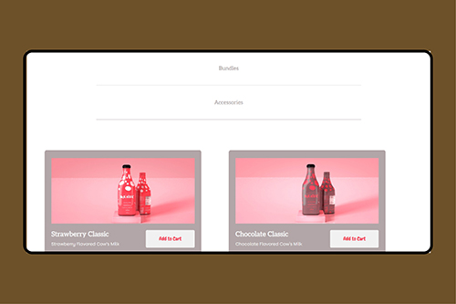
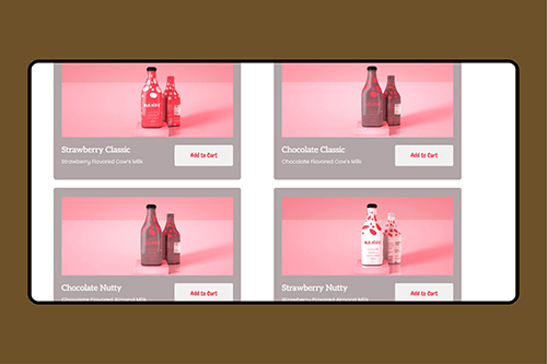
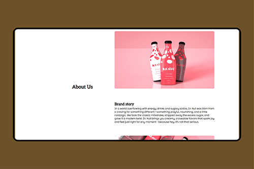
Dr. Nut is a conceptual milkshake brand positioned as a healthier, everyday alternative to sugary energy drinks and alcohol-heavy menus. The project focused on transforming a strong brand idea into a fully responsive, mobile-first product website that combines bold visuals, custom graphics, and interactive front-end development.
Technologies Used
- Trello
- Figma
- Cinema 4D
- Photoshop
- After Effects
- HTML 5
- CSS 3
Roles
- Project Manager
- 3D Designer
- Motion Designer
- Graphic Designer
- Front-End Developer
My Role
- Led the end-to-end development of the Dr. Nut website, from research and design to front-end implementation.
- Designed the layout and user experience based on research insights from real-world product websites.
- Hand-coded the site with a focus on clean structure, responsiveness, and maintainability.
- Created and integrated all visual assets, ensuring consistency between branding and implementation.
- Applied problem-solving and logical thinking to build interactive elements such as the hero carousel.
- Balanced creative decision-making with technical constraints to deliver a polished product-focused experience.
Challenges Faced
- The main challenge was creating a balanced timeline that allowed enough time for branding, wireframing, and development without one phase affecting the others.
- Managing both creative design work and coding required careful time allocation to maintain quality in both areas.
- I intentionally built in buffer time to handle unexpected issues, knowing that not everything would go according to plan.
- Translating design ideas into a fully responsive website required problem-solving and adjustments throughout development.
- Overall, the challenge was about time management, flexibility, and maintaining consistency across all stages of the project.
My Process
- Researched product-based and beverage brand websites to understand layout patterns, content hierarchy, and user expectations.
- Studied how successful product sites use visual storytelling, especially within hero sections and above-the-fold content.
- Translated research into a clear design direction that prioritized bold imagery, simplicity, and strong product focus.
- Built the website using a mobile-first approach, designing and coding for small screens before scaling up.
- Implemented responsive layouts using flexible grids, media queries, and scalable typography.
- Generated and optimized all custom graphics and product visuals specifically for web performance.
- Developed a responsive hero image carousel, ensuring smooth behavior and consistent visuals across devices.
- Tested and refined interactions and layouts across breakpoints to maintain usability and visual clarity.
The Outcome
- Delivered a fully responsive, mobile-first product website that effectively showcases the Dr. Nut brand.
- Successfully translated a conceptual brand into a functional, interactive web experience.
- Strengthened front-end development skills, particularly in responsive design and interactive components.
- Gained confidence in turning research and design concepts into working code.
- Identified opportunities for future improvement, including enhanced interactivity and performance optimization.